16 December 2012

Illustration Friday: SNOW

snow Here's a quick illustration friday drawing... .Not the most well put together, but I had a free afternoon and was hoping to pump out a quick drawing.

Somehow, the colors got all sorts of screwy when I uploaded it to the web.  I guess you gotta be careful with those cyans and magentas.  The first time I uploaded it, the pinks in his face were popping so much that I had to go back and desaturate them to this extremely vivid color.  But the cyans... well nothing i did could help them.

 Note to self, be wary of cyan.

   Not the best, but a fun way to spend the afternoon, hope you like it.  The keyword: SNOW

04 December 2012

LIGHT IN THE DARKNESS

Liberty Light   Finally, I've gotten through writing up Stephe's Artist Series.  I don't even know if they are still available, so why does Stephe want me to type these up?  Just a sec.  I'll go ask him.

Okay, so apparently it doesn't matter that much.  As in, it's fine that it's late. It would've been better if I'd've  promoted the designs while they were actually at stores, but probably someone else has taken care of that and this site is really more about cataloging the designs rather.  But, next time, I should sit on this stuff, so long..... story of my life.

Anyways, this design is my favorite of all of them. Have I said that before? I hope not.  There's something that just seems really old about this one.  I like the pose and expression and everything.  And the colors are pretty cool too.  I would probably even wear this one.  Sure it's a little loud. But every once in  a while you need a loud shirt, right.  I also think the halftone pattern would feel really cool if it were printed kind of thickly.

  I know everyone is asking, "So Eddie, what did you do on this one?" And the answer is..... nothing. I was out of town.  The only thing i remember is looking at the reference material and then coming back to teckpack the finished design.  Maybe that's why I like it so much. (sketches and stuff after the link)

02 December 2012

GRIN AND BEAR IT

Grin and Bear It 
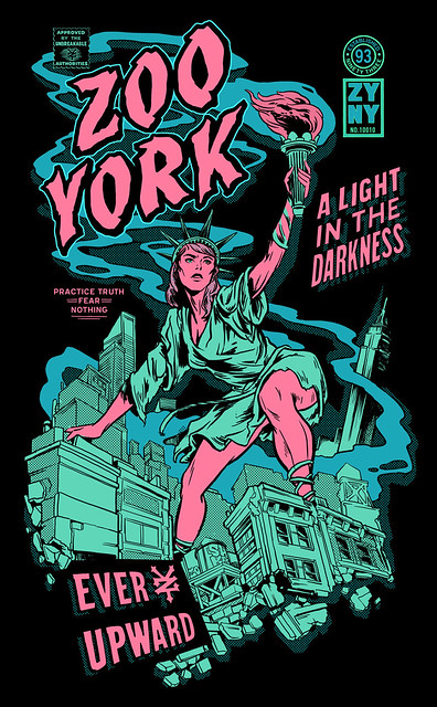
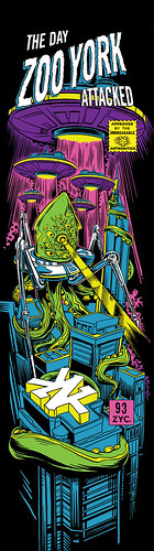
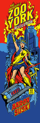
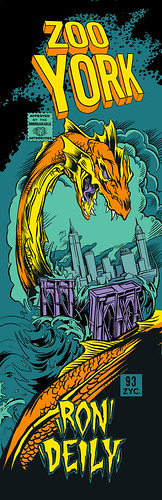
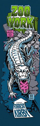
Okay, so it's been a while.... I feel like the last time I posted some actual graphics on here, it was, like,... Summer or something.
    Here's how my life goes. Stephe will finish up some projects and get super psyched about having a "web presence" again(especially since some japanese domain scalper stole his website name). So while he's working up some Creative Briefs and sketches, he tells me to start blogging and tumbling and whatnot. So then, I've gotta make up a bunch of stuff about all these illustrations, even though usually I have no idea what to say. A lot of times, he'll just laugh when I show him what I've written, but every so often, if I catch him on a bad day, he'll make me rewrite these blog posts over and over again until they're "right". whatever that means. It's your money, dude.
   Well, it's been Crazy-go-Nuts around here all fall. I've gone from t-shirt and jeans to puffy coats and scarfs, and yet, I still haven't had the time to write up posts on designs that dropped in the summer.

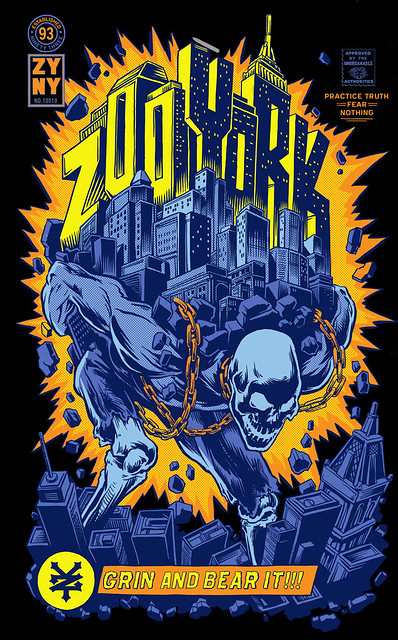
   Anyways, What's this piece? Grin and Bear it. Aaah yes, Grin and Bear it. That was a good one. We played around with colors for that one for a few days. If I can find all the color treatments, I'll drop them at the bottom of this post. While I was coming up for colorways for this one, Stephe was in one of those moods I mentioned above. The one where he wants to fine tune everything and can't be pleased. I guess it's good, and I end up learning a thing or two about color theory from it. But sometimes I wish he'd just put the graphic to bed and deal with the A instead of the A+.
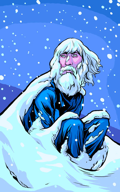
12 September 2012

Illustration Friday: IMAGINATION

Illustration Friday has crept upon me once again, and I fear i will not have enough time to finish this one off by the Thursday night deadline.  I think I bit off more than i could chew with this one, although I like it enough to hopefully finish it at a later date.... hopefully.  That line's been said too many times in the past, and rarely ever been true.
  This was another wandering image.  I didn't have much of an idea when I started the drawing.  When I was done sketching though, this is what emerged.  It's a little more biological than I thought it would be.  At first, I figured it would be more of a light pattern blasting from the head, i guess that didn't come to pass.

   The key word here: Imagination.

07 September 2012

PAY THE PIPER

Pay the Piper Oh man, Stephe's been working me hard the last few days cause we took off for Labor day. I guess he wants me to be grateful for my days of or somethin.  Nah, just kidding.  But the studio has been really crazy ever since we took Monday and Tuesday off.  For everyone who was waiting patiently for an update with a skull graphic, sorry for the delay.

  Anyways, Check out this punker Uncle Sam skeleton graphic.  The 99% must've been on his mind while coming up with this one. I like how this one sort of detours from the rest of the series by being a little more DIY and Zine inspired.   But it still fits in with the Captain America title font and the rest of the comic assets.
  This graphic popped out super quickly. I barely got to work on it at all. If you look at the sketch, it looks like Stephe just drew his final lines right over it.  All I got to do was figure out how to flip the colors for a 2 color Black background option. (which I think i did pretty well, thank you very much)

01 September 2012

IllustrationFriday: IDENTICAL

It seems that I can't stop drawing these Illustration Friday Drawings.  And though I've got a ton of stuff on my plate right now, lately I've had the strongest desires to do my own stuff.
  So, for the second week in a row, I'm turning back to Illustration friday to fulfill my whimseys. I'm pretty sure that this idea was already done a bunch of times over, and that the whole IF site if gonna be filled with a lot of "twins" drawings (well, and random drawings by jerks who just post whatever images they have while pretending to do the challenge).
  The first image that came to mind was the scary twins of the Shining. Yes, I know that most of the scariness is housed in their banality, but I wanted to add a bit more drama and otherworldly mystique.
  So, here you go.  Hope you like it, IF crowd.
Key Word: IDENTICAL
You can find the sketch after the jump

30 August 2012

STREET KING

Street King Here's the 3rd in that Artist Series Stephe did with Zoo York. This one, by far, wins the award for being the ugliest... I bet no one is gonna be turning this into a girls graphic any time soon.

  Originally, Stephe made this as a giant alligator, but the powers that be asked him to change it into a rat.... go figure.  Maybe rats have been proven to have more selling power than alligators? They're probably more "city iconic". Gators are sort of southern things, righ?  I wish it was still an alligator though, cause the rat is just kind of... too ugly.  Stephe could've done a nicer looking rat, i guess.  But the sketch of the alligator looked really cool. (check it out after the jump.)

29 August 2012

POSEIDON

Flush the Streets So, This one is called, well, I guess now it's called Flush the Streets, or something. Previously it was called Come Hell or High Water, but Flush the Streets sounds more Poetic.... it looses some of the Apocalypto Global Warming message though.. but whatever.
  Personally, I think that Stephe just came up with this idea cause he was like, "Hey, I wanna draw some waves and Octopus tentacles."  (Two things that I make fun of him for drawing) and then he was like, "Alright, add some buildings, and the empire state building, and....Neptune. Why not?"  And boom, Illustration done.
  Okay. so scratch that.  Stephe got a little mad at me for writing that and he lobbed a banana peel at me.  Um... he spent a lot of time thinking about this graphic and it somehow relates to another one he did where the city is snowbound and theres a Yeti thing or somethin.

28 August 2012

Illustration Friday: TALL

It's been quite a while since I've done an Illustration Friday Drawing.  I honestly haven't had time.   I guess I still don't have the time, but I needed to get myself into a good drawing head space. So, what the heck.  might as well whip up something fast..... it would be fun.  I haven't been able to draw something "for fun" in quite some time.
  It used to be the case that I'd try to make all my Illustration Friday drawing refer back to a Greek Myth. The box just seemed a little too confining.  So, I just started drawing and let the my mind wander a little.  When I woke up, this guy was staring back at me, and I was half way through with coloring him.  I like to think that he's one of those whole grain fed viking kids whose parents moved to America when he was in middle school, so now he's a giant among dwarfs.

  The key word: Tall.
 Hope you like this pictorial missive.

CITY PROTECTOR

City Protector Hey All,
  Stephen's been too "slammed with work" (that's his own phrase) to be able to continue to update his blogs and stuff, so he gave the task to me.  Right now he's drawing some monster or something.
  Anyways, This graphic was done for Zoo York as part of a second Artist Series, cause the first one did really good.  After coming up with 7 board designs, they were like, "Hey, come up with 6 more of these Monster-Destroying-the-City Tshirts."
   And he was like, "Okay".
I think it's a little hard to figure out how to make more than 7 of these comic things, but Stephen didn't seem phased.  I left the studio that night at around 6ish.... and when i came back two days later, he already had the sketches ready to go for me to put into the Creative Brief.
  More (and Sketch) after the break

27 August 2012

Apparel Graphics

Hey all,
  My trusty new assistant, Eddy, just dropped a bunch of T-shirt graphics on my Apparel Graphics page... and the best thing is, he put them on actual T-shirt bodies.  now you can see them as they are meant to be displayed rather than just seeing illustrations floating in space.

  Thanks Eddy.

25 August 2012

King Westgate.


Further Proof that I was right in choosing to make Westgate's board be King Kong. I can't remember how long ago it was that I made this shirt, but I'm pretty sure it was my first season at Zoo.
    When JCPenney started carrying Zoo products, they raided the archives for printable designs. i guess this is one of the graphics they liked. Henceforth, REPRINT!! Keep on being a manimal Westgate.
 *photo credit to Sean Cronan.

CHAZ ORTIZ


Comicboard1ortiz, originally uploaded by Stephen Halker.
Of the series, I think this is my My favorite. I can't say if it's the best looking of the group, but the process of making it was so fluid, I never got sick of it.

Usually, in every illustration project, about half way through, I realize that I have no idea what I'm doing, and feel trapped in a cage I can't get out of. Then I try all sorts of options to fix it. And then usually i end up realizing that there wasn't a problem to begin with, I'd just been staring at the drawing for too long.

With this board, I never had to go through that. It was just a strait shot. Wind in my sails the whole time.

So, why, you ask, is this the Chaz Ortiz board. Shouldn't it be obvious, The dude is a king among beast concurring tricks faster than humanly possible.

Hey Chaz, what do you gotta say?

"Just skate hard, skate your best, and don’t get yourself down. Just go out there and skate how you know how to skate, make sure you have your run planned, and just have fun."

23 August 2012

TeamBoard


Comicboards6Aliens, originally uploaded by Stephen Halker.
This one almost got dropped due to technical difficulties. But Chapman, the Board maker, liked the design so much that he asked if we could use the graphic as the team board. I was like, "Dope". And with a few tweeks here and there it was spiffied up and ready to print.

I really like drawing Octopus legs. They have a certain type of challenge and grace to them. So I had a lot of fun drawing these octo-aliens.

22 August 2012

Kevin Taylor


Comicboards3Robot , originally
uploaded by Stephen Halker.
This board was an add on, and it continued to change though out the design process. My buddy Ken Morimoto and I kept on going back to the drawing board trying to find the right composition and color scheme.
Since we already had the rest of the boards nailed down, it was a little challenging to find a colorway that would work with the rest of them and also be different enough to stand out all by itself. For quite a while, the robot was looking way to much like Iron Man (the type treatment doesn't help) but now that it's all greens and purples, i think it stands pretty strong.
I hope you like it, Mr. Taylor.

21 August 2012

Brandon Westgate


Comicboards4Westgate, originally uploaded by Stephen Halker.
Ohhhhhh Yeah. Nothing quite like a good ol King Kong graphic for Westgate. I cranberry color choice is to refer back to his bogging background.

A while ago, when Westgate first turned pro, I made a deck featuring a girl on a pool raft floating on a cranberry bog. so I added the damsel in distress as an ode to the old board.

You can never draw too many King Kong graphics for Zoo York.

20 August 2012

Aaron Suski


Comicboards5suski, originally
 uploaded by Stephen Halker.
So, I put the French Liberty leading the people, the 99% riots, and Wonder Woman in a blender, and this is what came out.

RonDeily


Comicboards6Deily, originally uploaded by Stephen Halker.
So, while I was working in-house at Zoo, I would draw one Comic-book-cover-looking graphic per season. After a few seasons went by, it got a little difficult to find new scenarios that would work. I always wanted to do something with the bridges and waterways. So, this was my chance.
Any graphic where you get to draw splashy water, a dragon head, and Kirby crackle has gotta be a fun one. Oh, and I think the type was taken from.... the New MUTANTS? it was some sort of X Men offshoot.

More to come.

19 August 2012

Forrest Kirby


Comicboards7Kirby, originally uploaded by Stephen Halker.
Taking some inspiration from the stories of Mole People and Alligators in the subways, I draw up a design that was just as powerful, but on a bit more of a human scale. For the Type, I as riffing off of the Swamp Thing masthead.

Hope you like it.

STEPHEN HALKER X ZOO YORK

It's been a long time coming, but my board series is finally out! Brian Mackin and I were throwing around board series ideas for quite a while before this one stuck.
 We started out with the Idea of doing 5 designs, but somehow it kept on growing, so pretty soon they approved 7 or 8 designs. So, with the help of my old intern, Ken Morimoto, we cranked these things out and sent them off. These designs were also turned into my first Artist Series of T shirts for Zoo. Hopefully I'll be posting those soon as well.
 
Boards can be found where ever fine skating goods are sold. More posts coming soon.